Words
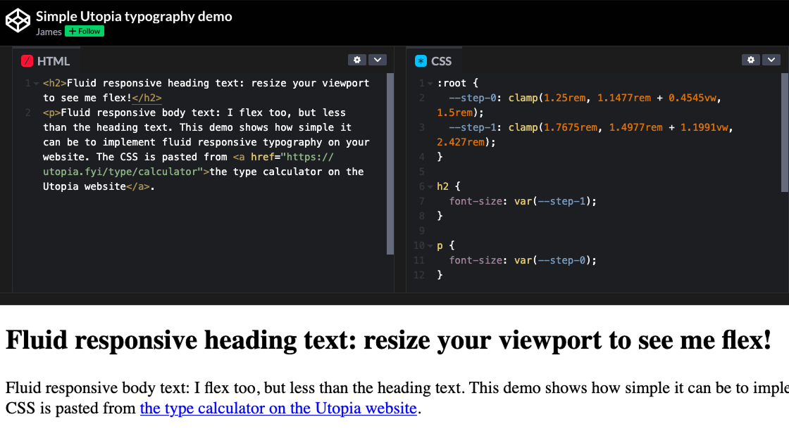
Fluid responsive typography: easy when you know how
I wrote a tiny CodePen to show how little code you need to get your typography scaling smoothly with the viewport. Read the article →
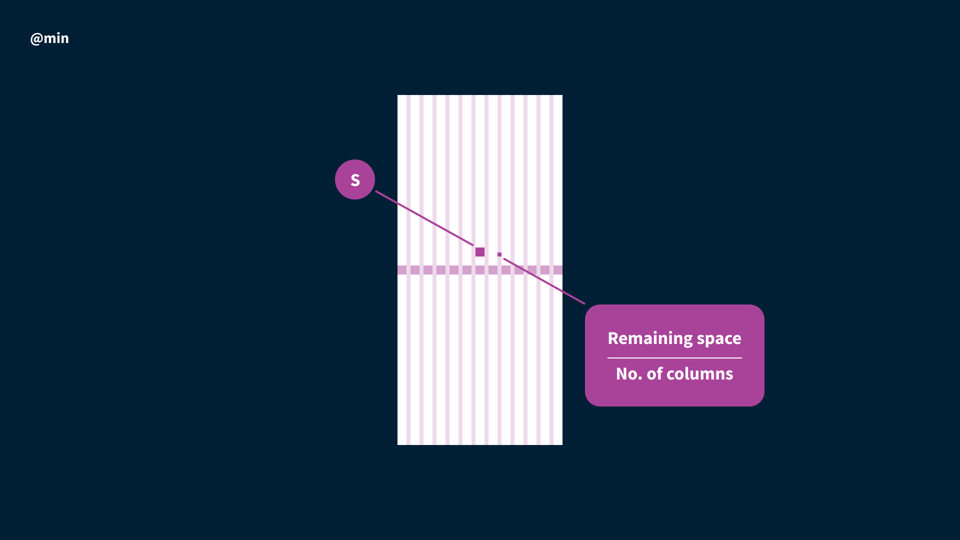
Designing a Utopian layout grid: working with fluid responsive values in a static design tool.
A layout grid is a useful aid for a designer organising information in a given space. Although these grids have their roots in print design, where dimensions are fixed, fluid layout grids still have some utility in responsive design. Read the article →
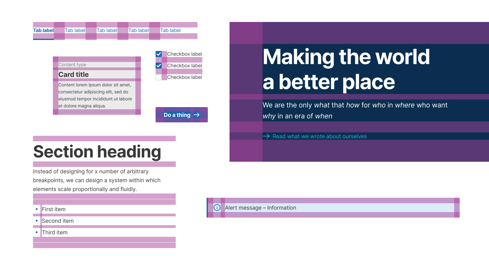
Designing with a fluid space palette
Space is the ultimate fundamental; the most ubiquitous “thing” there is. In fact our brains generally perceive space as the “nothing” between the “things” they prefer to fixate on. We move through this silent, invisible, three-dimensional emptiness with very little resistance and rarely think about it at all. So is it any wonder space is an often-overlooked element of design, appearing almost by accident between the bits we spend our time carefully crafting? Read the article →
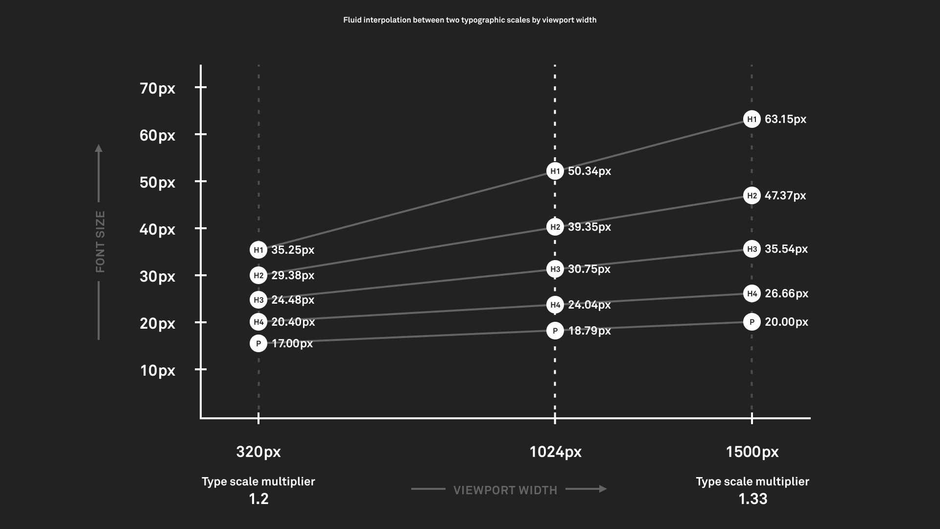
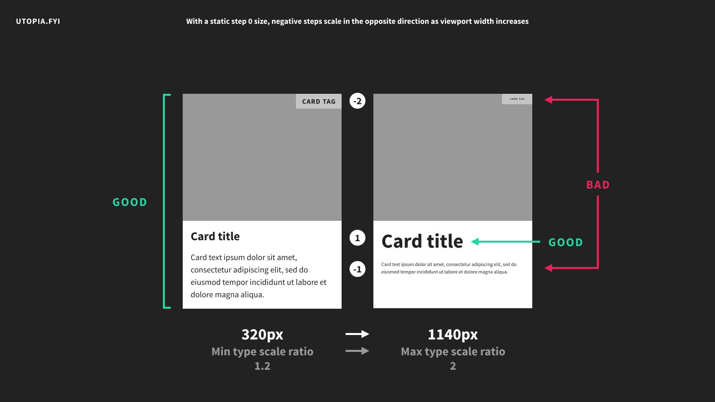
Dealing with negativity in fluid type scales
A quirk of composing type to a scale is that a larger ratio will translate to larger font size jumps both above and below your body copy size. This means any text smaller than your base size might end up smaller on a large screen than on a small screen, which is generally undesirable. Read the article →
Designing with fluid type scales
Breakpoint-based type sizing has always felt a bit arbitrary to me. It seems like equal parts guesswork and compromise, where the better we want it to work, the more stuff we need to design. It strikes me as inelegant and inefficient. Read the article →