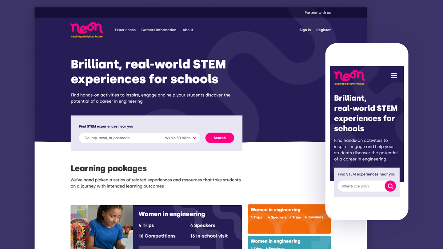
Neon is a new platform from EngineeringUK which brings STEM to life through real-world engineering. Neon curates experiences to save teachers’ time and attention when looking for engaging activities for their students.
Clearleft were tasked with creating a new brand and designing the digital architecture for the as-then unnamed platform in a particularly short time frame. The entire brand proposition and visual direction were defined and refined in a matter of weeks via a series of workshops and playbacks.
As visual designer on the project, my main responsibility was navigating the project team towards a suitable visual direction that would feel appropriate to the platform’s users.
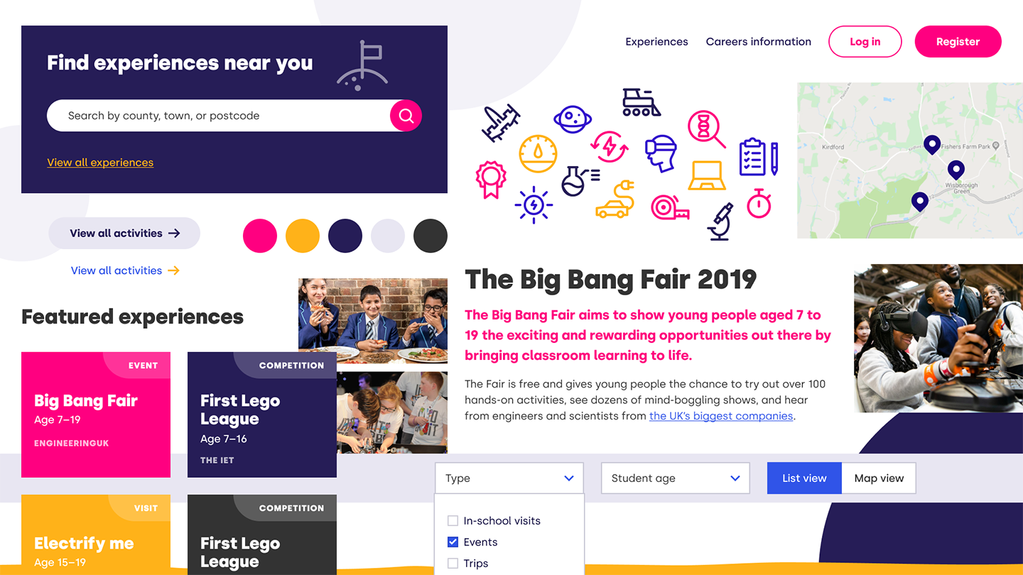
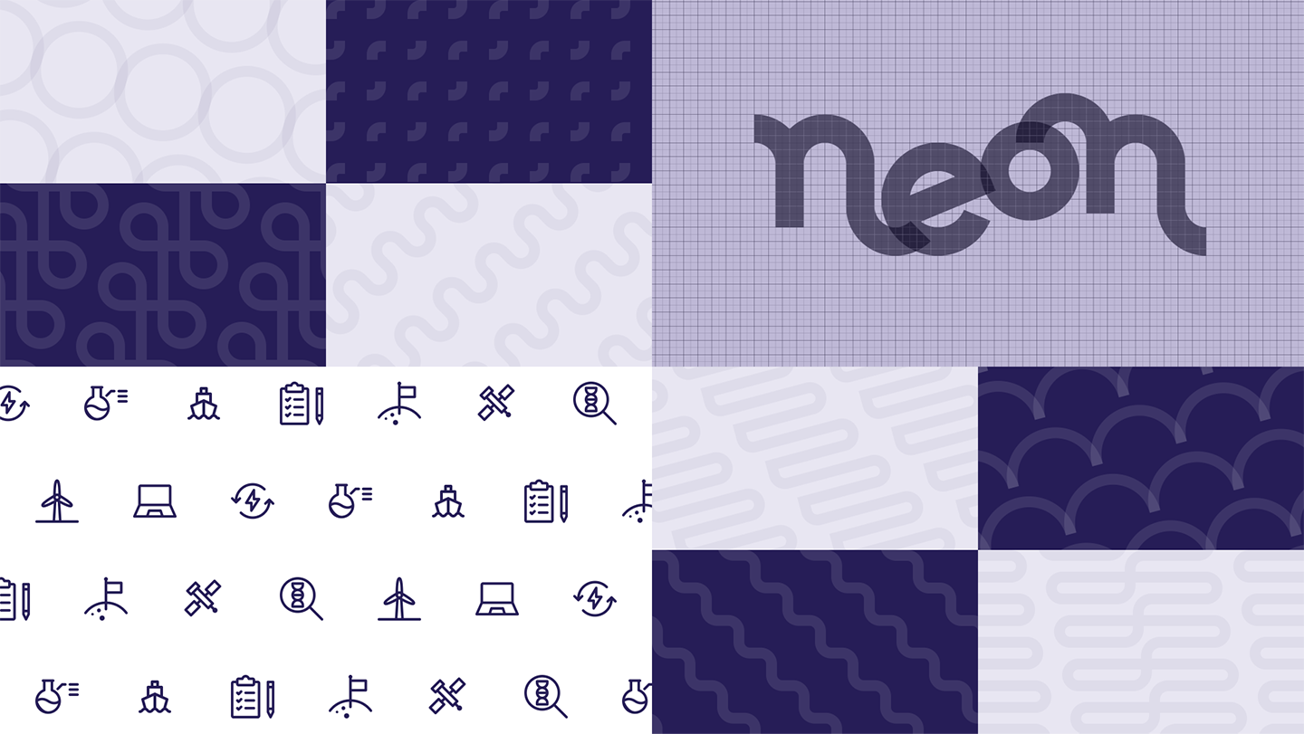
The new visual direction applied to an indicative website design.Element collages are a quick way to get a feel for a new visual identity. Showing snippets of interface elements can give stakeholders a glimpse into a possible future and an opportunity to nudge the direction to better align with their expectations. This collage was completed before we started work on the logo or even had a name for the platform. An element collage should look like a collage, not a web page design.Some of the logo variations that materialised during the process. The final version is shown here in the centre. Built from a set of connected geometric shapes, it’s evocative of a neon sign without looking exactly like one.I produced a selection of patterns to suggest materials and structures that could work across the many subtypes of engineering. The patterns are geometrically constructed in the same way as the logo. I also picked a handful of icons that suit the overall visual direction.