Clearleft: snapshot of a moving target
Clearleft is a relatively small digital design consultancy with a big reputation. With the team count hovering around the twentyish mark, exactly what Clearleft is at any moment is a direct reflection of those people. The website has evolved a lot since the first version launched in 2005, and it’s never stayed still for long.
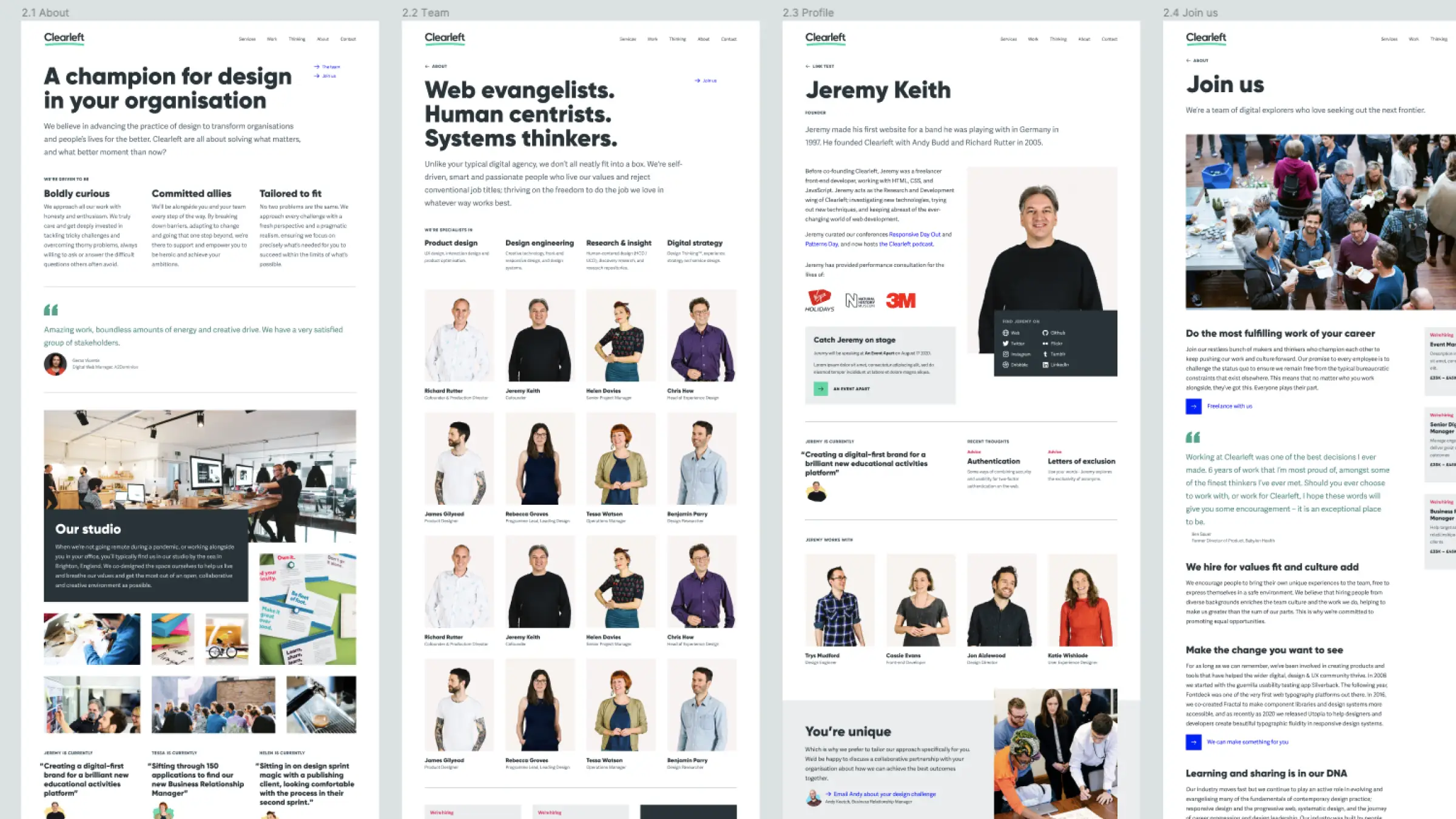
I joined the team in 2016 as a visual designer, during a significant piece of rebranding work, which included a major overhaul of the website. That was the last time the entire site design was updated in one push. Since then, the more modular design has continuously shifted and warped to represent the current roster of designers, event coordinators, and operations pros driving the business.
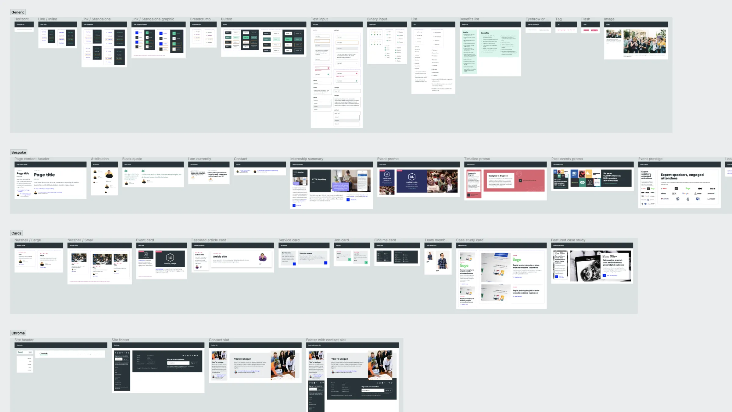
Over the past couple of years we’ve been methodically working through sections of the website to clarify our messaging, streamline the design and code, and improve consistency in general. It’s been a huge team effort, with people chipping away at the backlog between client work, gradually replacing individual sections with new designs based on a refactored and fluid responsive component library.
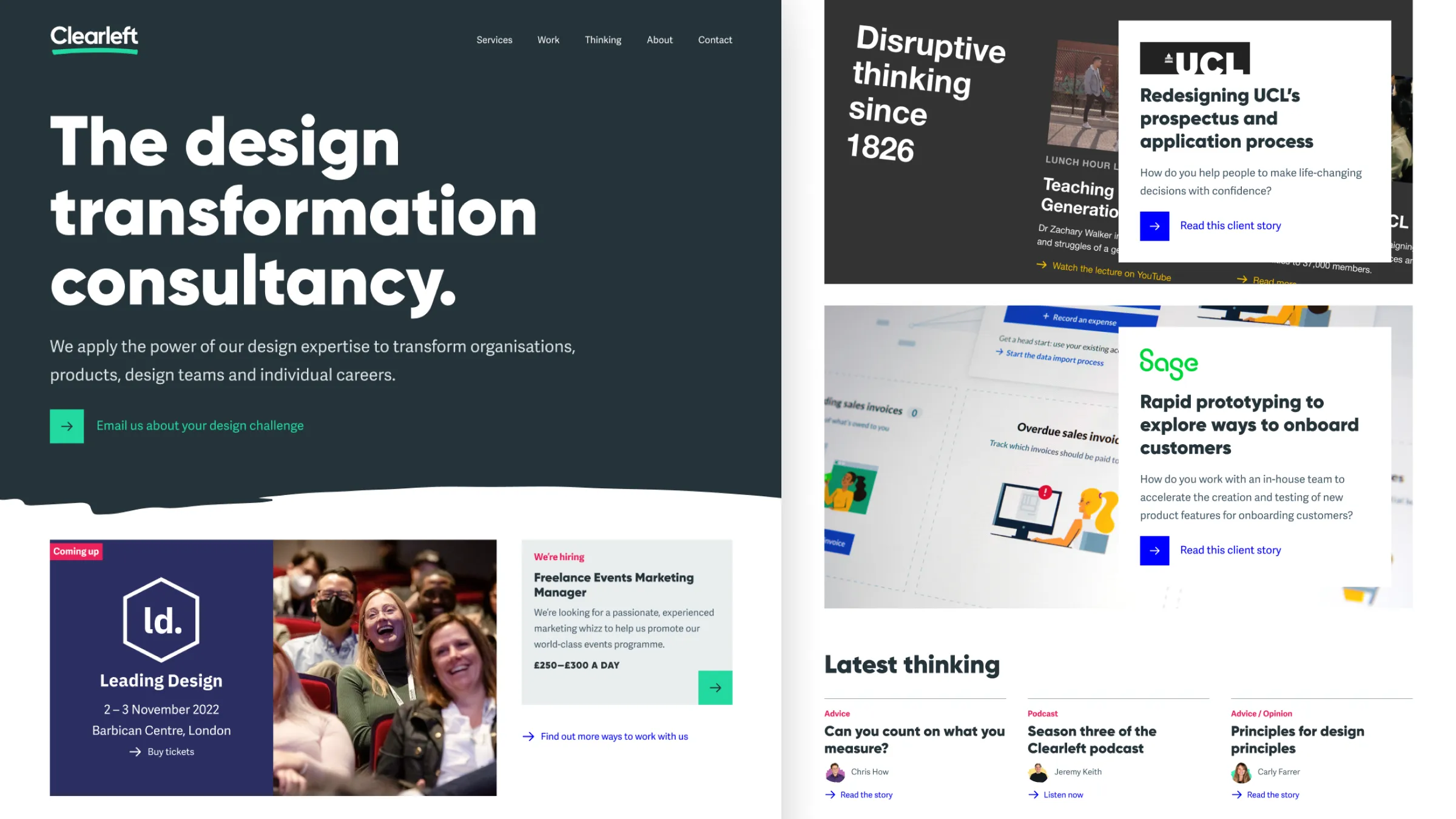
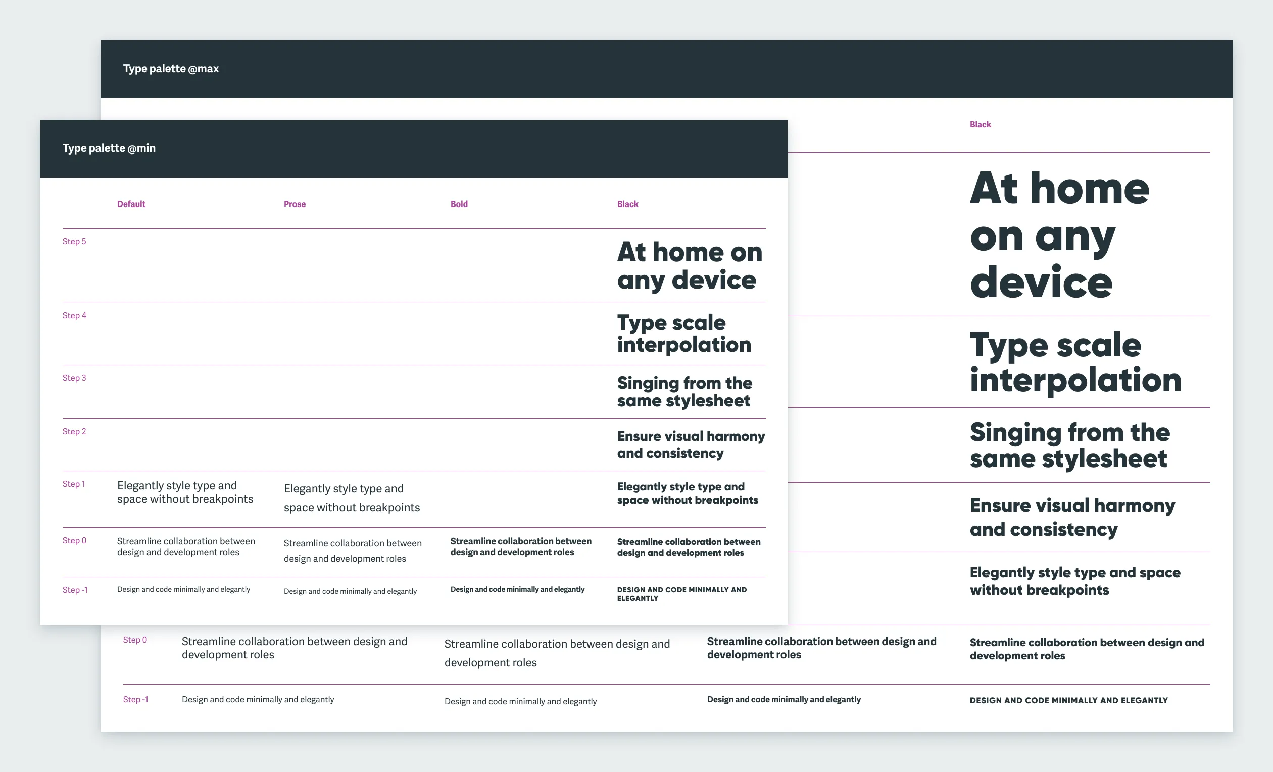
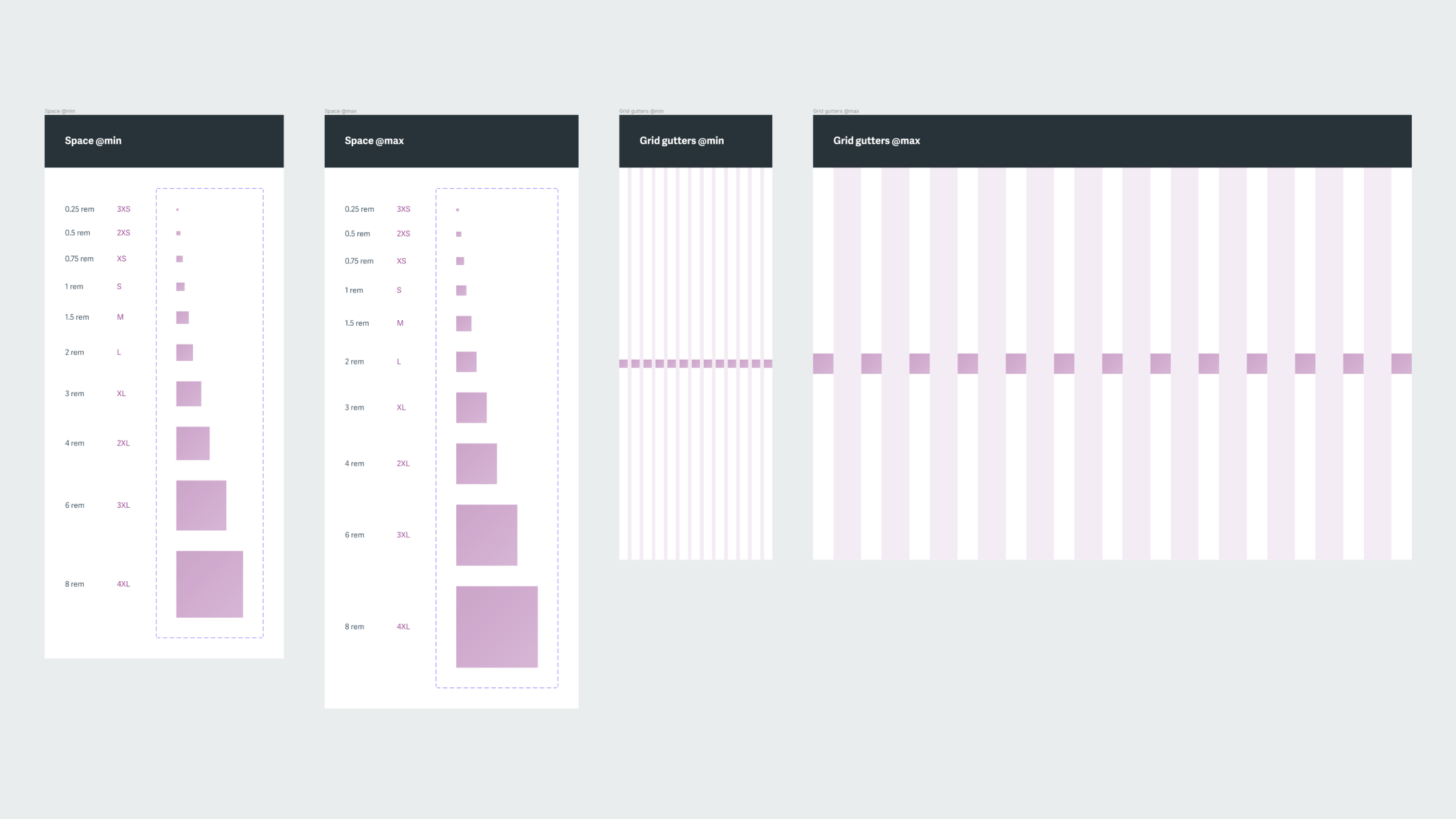
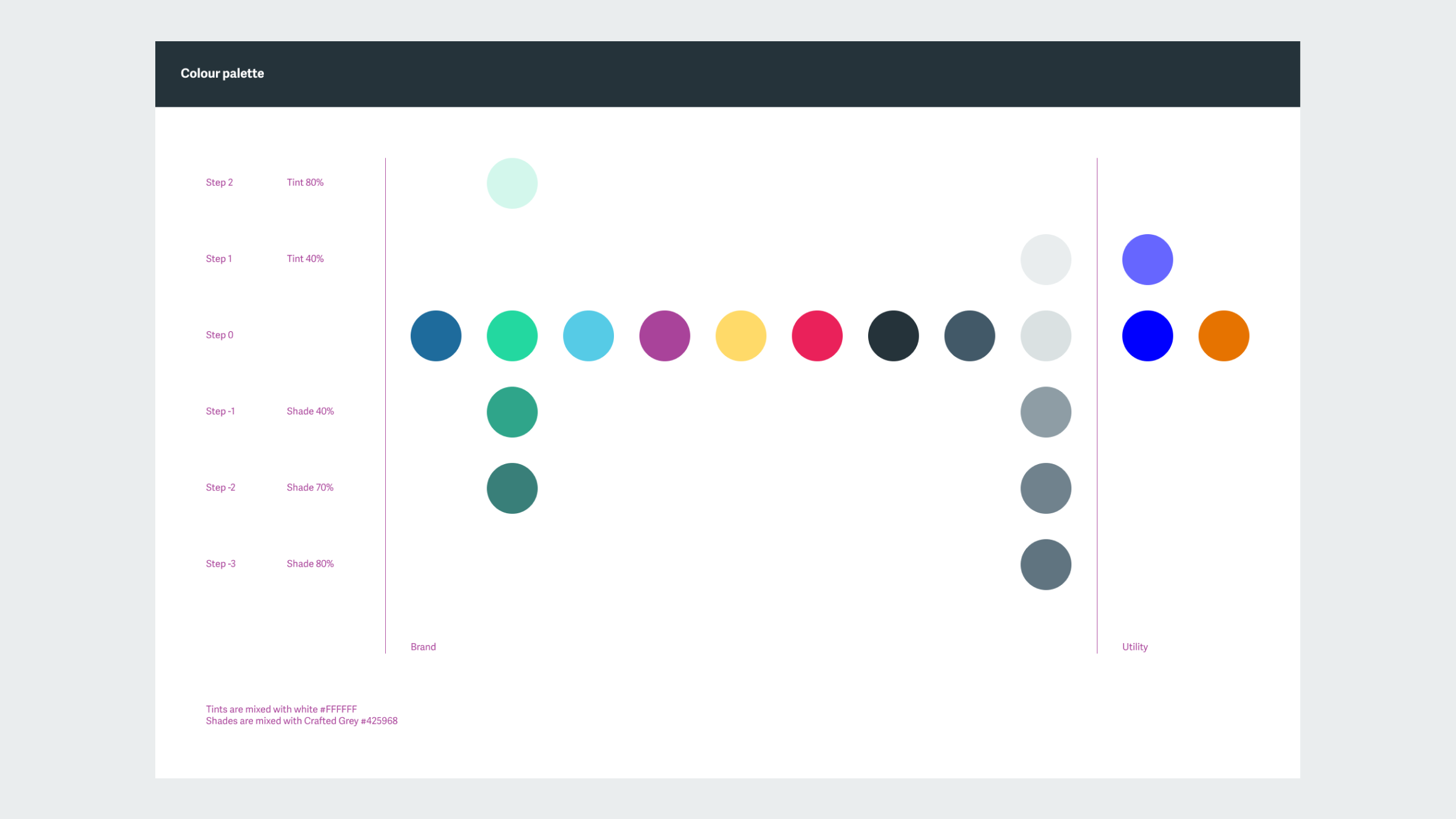
My preferred approach is to do as much as I can with the fewest possible ingredients. Every word on the current website is rendered in one of two fonts, in one of eight fluid sizes. The “chrome” of the site is mostly black and white with interactive elements highlighted mostly in blue and tags in red. This ruthless dialling down of visual volume boosts the signal-to-noise ratio and affords the featured photography and client work maximum presence.
This website is not finished, and it hopefully never will be. At the time of writing, though, this incarnation of the site is mostly of my visual design (and photography) so it’s probably a good idea to add some snapshots to my portfolio.